Custom Navigation Example
Don't care to read through? Here is the custom navigation example.
I've done a lot of custom navigation in the courses I've built. Some have been completly unique, others a blend of custom buttons and using the storyline player functionality. For this example it's a fully custom menu and navigation buttons.
The menu is set up as a lightbox slide to take learners to specfic sections of the course. The menu can be left like this for player control over the order they view the materials or it can be locked and force users to go through each section one by one.
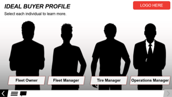
The slide navigation buttons are my favorite. I love the little movement of having the buttons move across the screen. These are simple back and next buttons, a custom hamburger menu, and a toggable closed captions button. These are all simple enough to update. On a few slides I have the next button start disabled and then it changes to the normal state when the timeline reaches a certain point or things are clicked on the screen. This allows the movement on the slide to be tailored to the content needs.
I hope you like this example of custom navigation and a professionally branded course.
